Free Four Column Chart Form
Form Preview Example
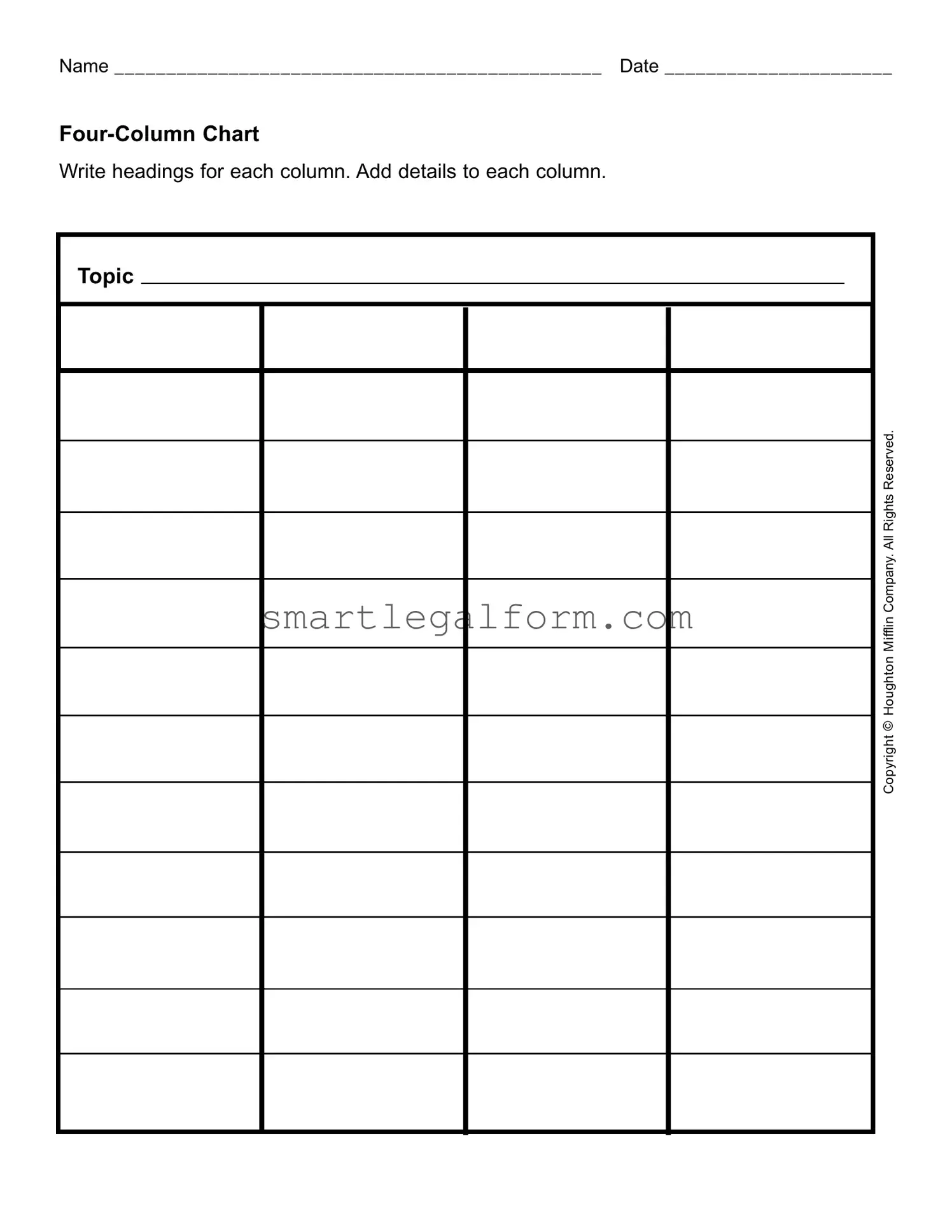
Name _______________________________________________ Date ______________________
Write headings for each column. Add details to each column.
Topic |
Mifflin Company.All Rights Reserved. |
Houghton |
Copyright © |
Common mistakes
When filling out the Four Column Chart form, individuals often overlook the importance of clear and concise headings. The headings serve as a guide for what information should be included in each column. Without well-defined headings, the chart can become confusing and difficult to interpret. This lack of clarity can lead to miscommunication and errors in data entry.
Another common mistake involves neglecting to provide sufficient details in each column. Each section of the chart is designed to capture specific information related to the topic. If individuals fail to elaborate adequately, they risk losing valuable context. This can hinder the effectiveness of the chart, making it less useful for analysis or decision-making.
People frequently make the error of not keeping the information organized. A Four Column Chart is most effective when the details are presented in a logical sequence. When information is scattered or presented haphazardly, it can create confusion. This disorganization can lead to misunderstandings and diminish the chart's overall utility.
Additionally, individuals often forget to review their completed charts before submission. This oversight can result in typographical errors, missing information, or incorrect data. A thorough review can catch these mistakes, ensuring that the chart accurately reflects the intended information.
Lastly, some users fail to consider the audience for whom the chart is intended. Understanding the needs and expectations of the audience can significantly influence how the chart is filled out. Tailoring the content to suit the audience’s level of understanding can enhance communication and ensure that the information is conveyed effectively.
Dos and Don'ts
When filling out the Four Column Chart form, it's important to follow certain guidelines to ensure clarity and accuracy. Here’s a list of things to do and avoid:
- Do write your name and date clearly at the top of the form.
- Do create clear headings for each column before adding details.
- Do ensure that the topic is relevant to the content you are filling in.
- Do use concise language when adding details to each column.
- Do review your entries for spelling and grammatical errors.
- Don't leave any columns blank unless instructed to do so.
- Don't use excessive jargon or complicated terms that may confuse readers.
- Don't overwrite or clutter the form with unnecessary information.
- Don't forget to save a copy of the completed form for your records.
- Don't ignore the copyright notice; ensure compliance with usage rights.
Other PDF Documents
How Do You File a Mechanics Lien - Helps maintain the right to payment for materials and labor provided.
Goodwill Receipt - Your contribution is making a difference; here’s your proof.
In today's digital marketplace, utilizing a gift certificate can enhance customer engagement and loyalty, making it essential for businesses to consider options like the ones available at TopTemplates.info, which offer valuable resources for effective gift certificate forms.
Free Facial Consent Form Template - This agreement will help foster trust in our treatment relationship.
Similar forms
The Four Column Chart form is a useful tool for organizing information. It shares similarities with several other documents. Here are nine documents that are similar to the Four Column Chart form:
- Spreadsheet: Like the Four Column Chart, a spreadsheet organizes data into rows and columns, allowing for easy comparison and analysis.
- Table: A table presents information in a structured format, similar to how the Four Column Chart displays data across different categories.
- Matrix: A matrix organizes information in a grid format, making it easy to see relationships between different sets of data, much like the Four Column Chart.
- Outline: An outline breaks down information into main points and subpoints, similar to how the Four Column Chart categorizes details under specific headings.
- Mind Map: A mind map visually represents ideas and concepts, showing connections between them, akin to how the Four Column Chart organizes related information.
- Employment Application PDF Form: This standardized document, used by employers to collect essential information from applicants, shares similarities with the Four Column Chart as both tools help in organizing crucial data effectively. For more details, visit documentonline.org/blank-employment-application-pdf.
- Checklist: A checklist provides a simple way to track tasks or items, similar to how the Four Column Chart can help track different aspects of a topic.
- Report: A report often summarizes findings in an organized manner, much like the structured presentation of information in the Four Column Chart.
- Presentation Slide: A presentation slide can display information in a clear, organized format, similar to the way the Four Column Chart presents data visually.
- Data Dashboard: A data dashboard presents key metrics and information at a glance, reflecting the organized layout of the Four Column Chart for quick reference.